The Discovery
When Braden approached me about creating the brand identity for his new media company, he had a clear vision for the type of work he wanted to produce, but not yet for how the brand should look or feel. Should it be fun? Creative? Professional? My answer was simple: yes—all three. Too often, brands treat these directions as if they're mutually exclusive, when in reality they can complement one another. The challenge became creating an identity that balanced professionalism with imagination while remaining approachable and memorable.
The Tagline: "Go Where Others Won't"
“Go Where Others Won’t” is more than an inspiring tagline—it’s a call to action. It immediately evokes the spirit of exploration, not only in a physical sense, but also through creativity and innovation. I wanted the visual identity to embody the pursuit of the unknown: pushing boundaries, challenging convention, and embracing discovery.
While I initially explored themes centered around the ocean, space ultimately became the strongest metaphor. Alongside our own oceans, space remains one of humanity’s greatest unexplored frontiers. Its mystery, scale, and limitless potential make it a fitting visual representation of a company committed to going where others won’t, and it invites clients to come along.
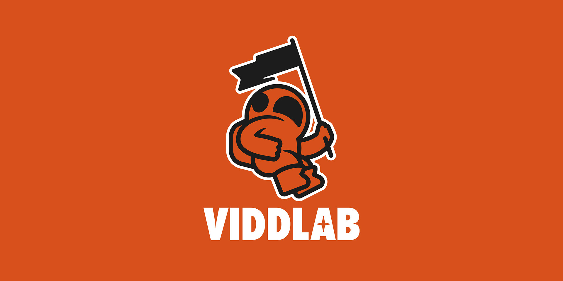
From there, we built the identity around the idea of an astronaut. Every detail of the character was intentionally designed to communicate curiosity, ambition, and forward momentum. Rather than depicting an astronaut who had already reached the destination, or one who was floating aimlessly, I wanted him to feel as though he was still searching, looking toward the next horizon, the next planet, the next opportunity to plant his flag—establish his territory. That subtle sense of anticipation reinforced the company's mission of continually exploring new ideas and untapped creative possibilities for its clients.



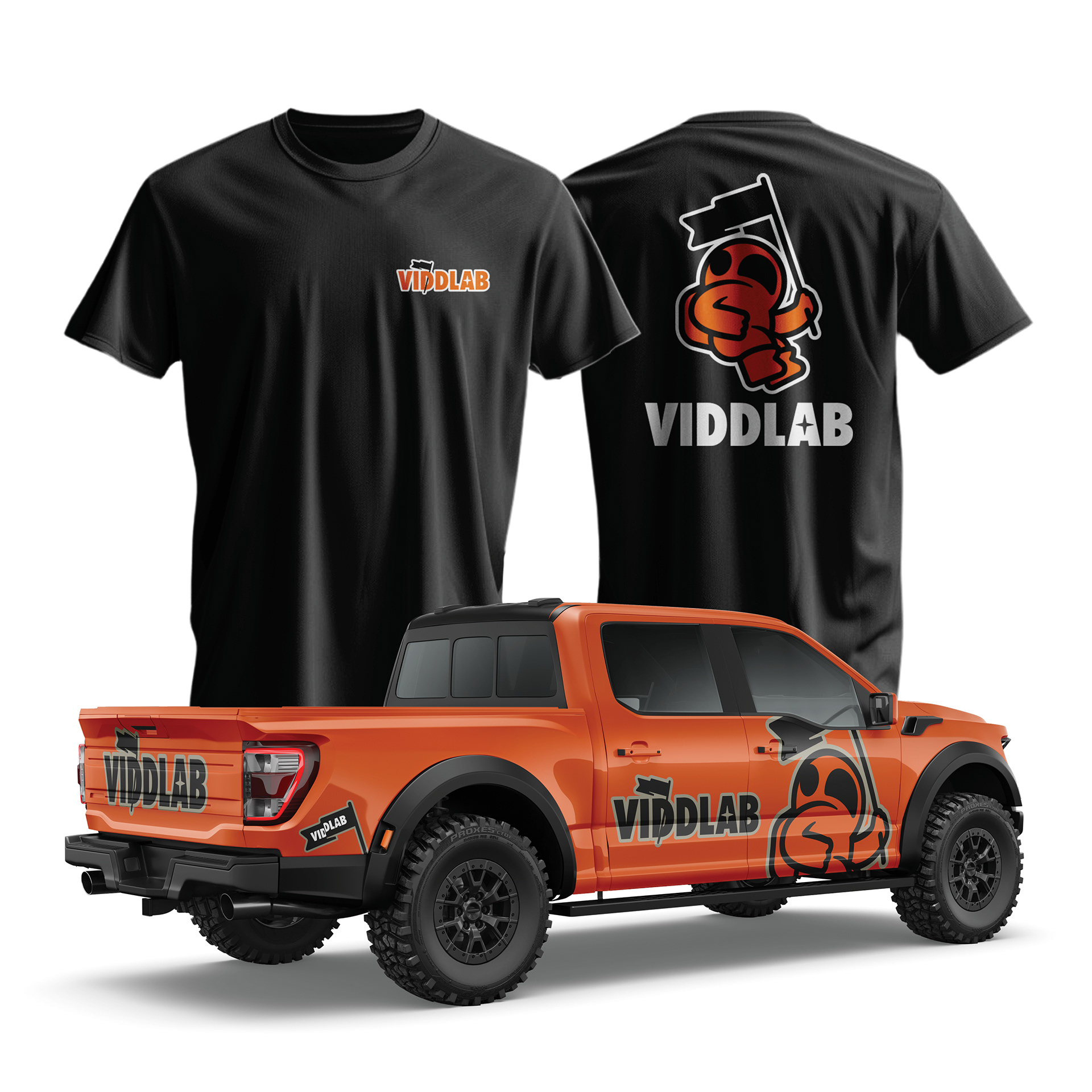
Functionality was just as important as concept. The astronaut needed to perform equally well across print and digital applications, from large-format signage to small social media profile images. I focused on creating a clean, recognizable silhouette that retained its personality even as finer details disappeared at smaller sizes. As long as viewers could instantly recognize the astronaut and the flag, the identity would remain intact and effective.
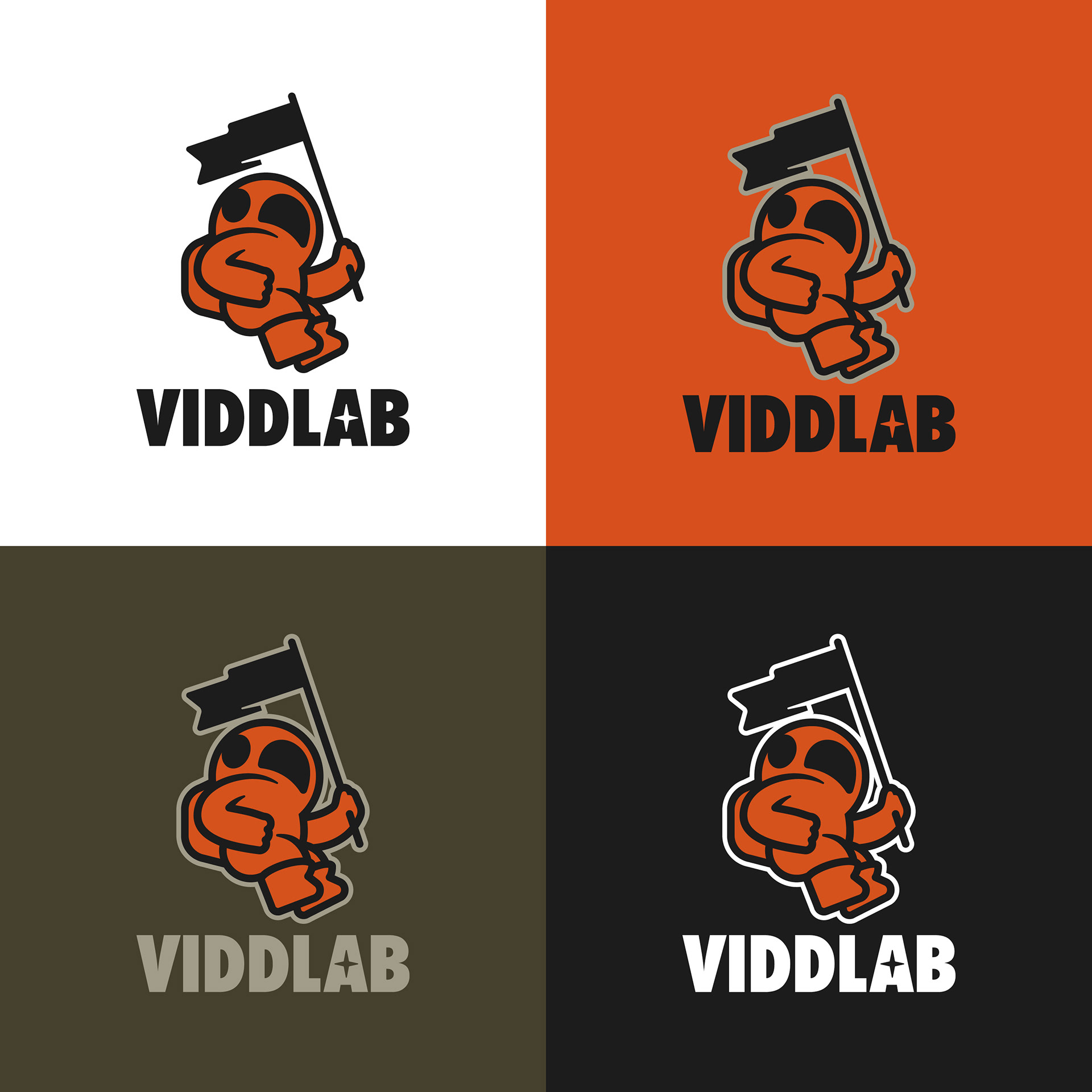
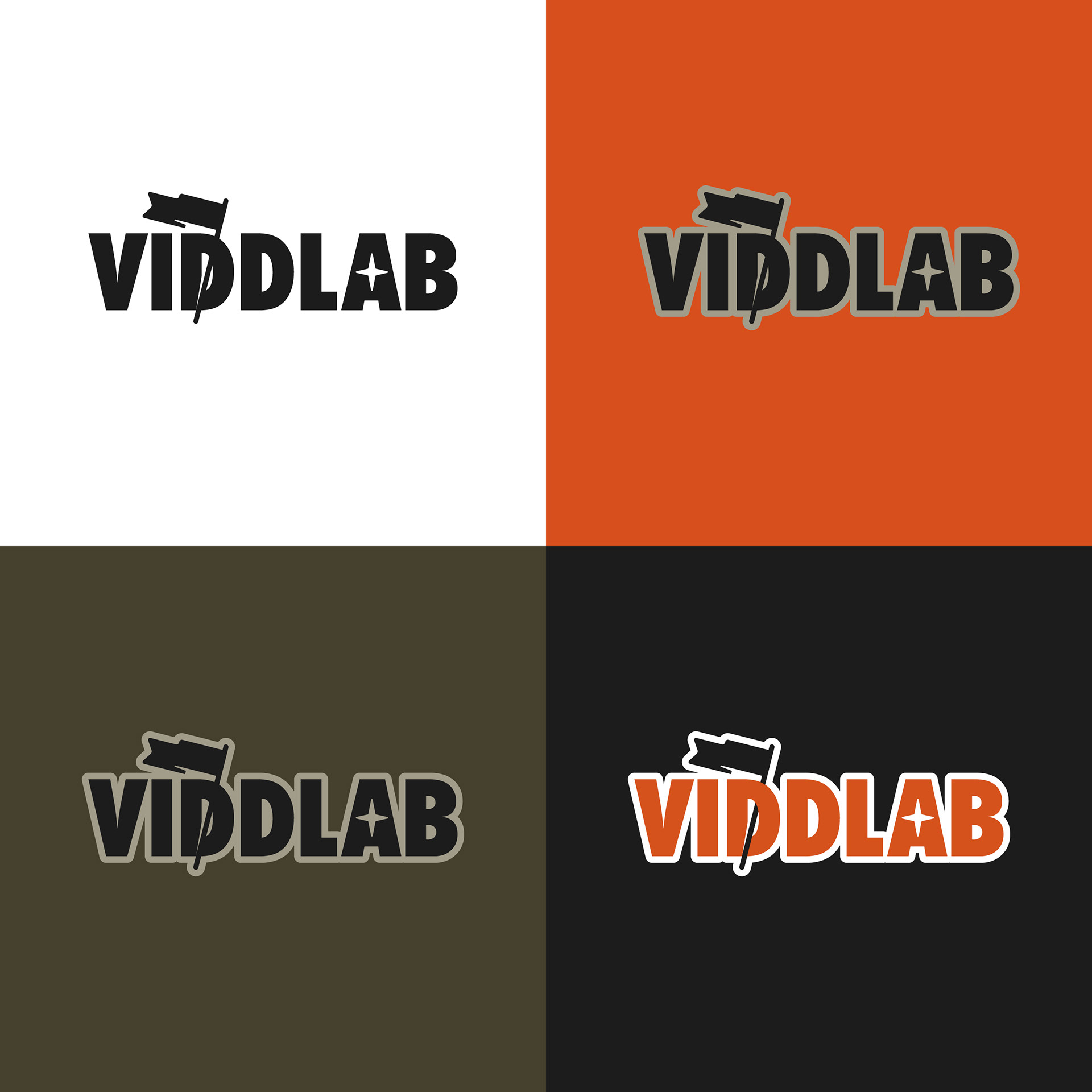
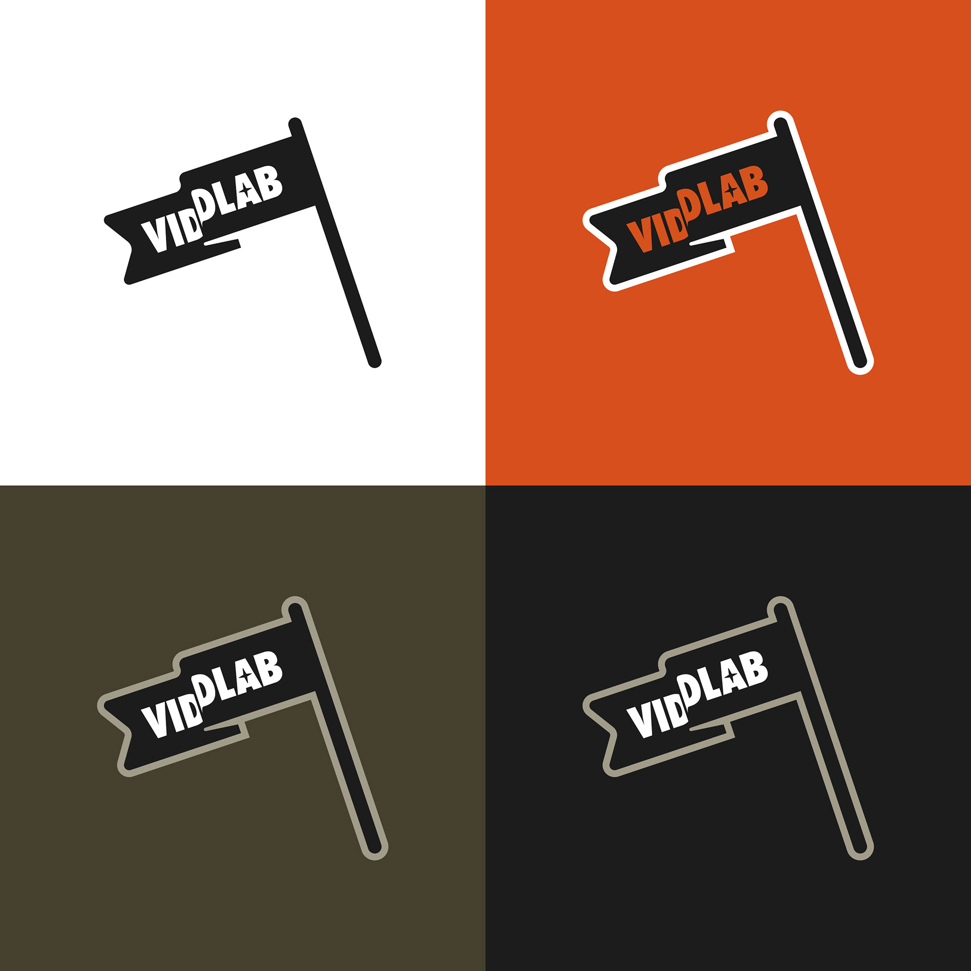
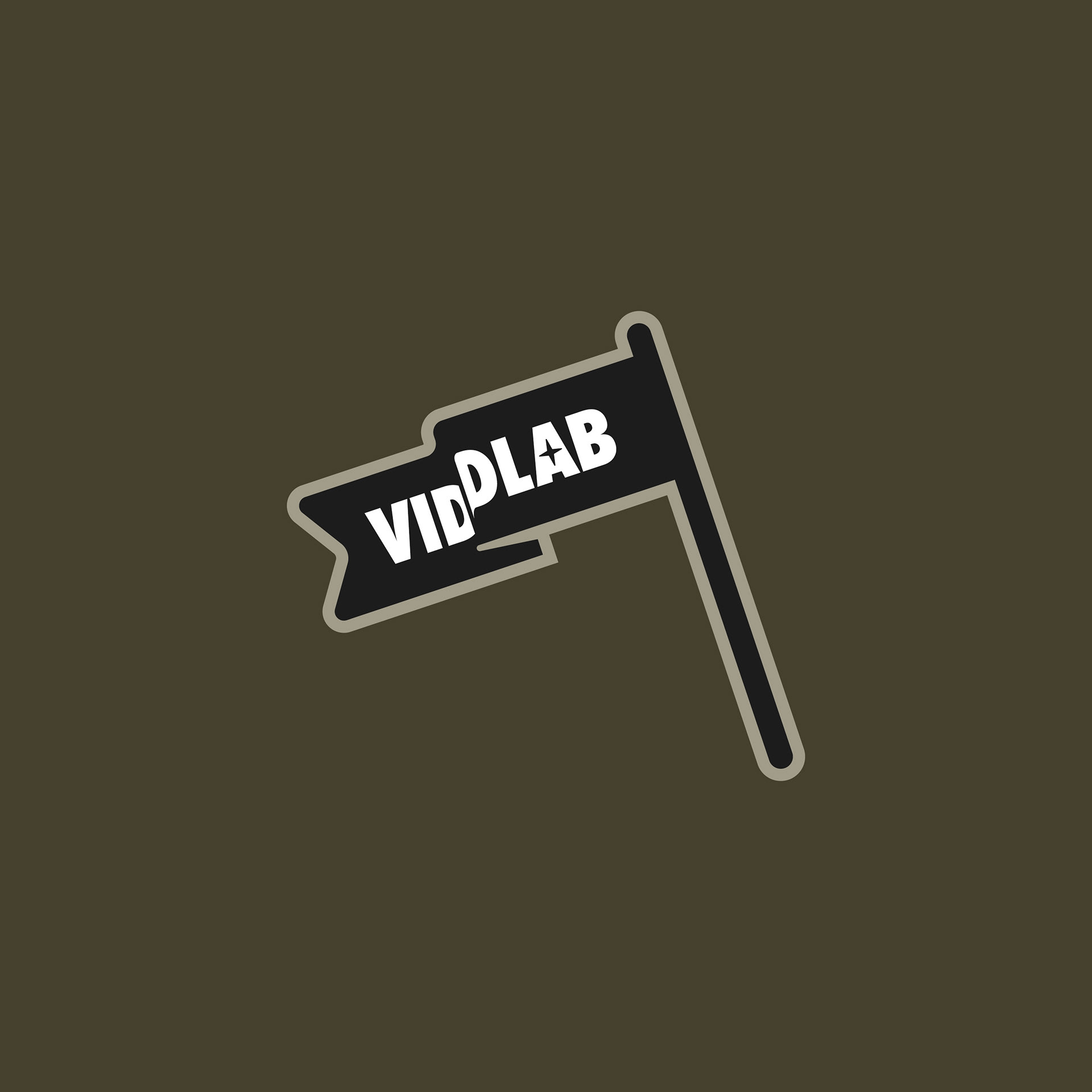
To complete the system, I developed a fully responsive brand identity that could adapt across a variety of applications. The final deliverables included the primary logo, a custom wordmark derived from the typography used in the main mark, the standalone astronaut icon, and a simplified flag icon based on the original flag within the logo. Each element was intentionally designed to function independently while maintaining a cohesive visual language, giving the brand a flexible, unified identity that could grow alongside the company.